The importance of the empty state in your applications

Today we’ll be selling shoes
Let’s say we are developing an application, that application's main purpose is to sell shoes, and that online selling tool has two main selections by the user:
- Look for your desired shoe: The user has the ability to write in a search bar the shoe's brand.
- Select a colour for your product: After selecting a specific pair of shoes the user must choose the colour he prefers.
It’s a pretty simple application but we’ll see how it can be iteratively improved by being conscious of the empty states we might generate.
Perfect flow
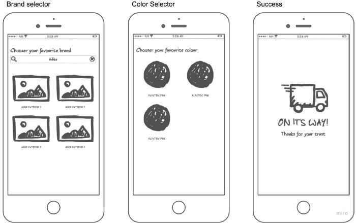
In a perfect situation, our user’s going to input his preferred brand, after that he’ll visualize a couple of shoes. He’ll choose the one he likes, and then he’ll pick a colour before proceeding to a success screen.

But there’s something we are not taking into consideration: what should happen if there are no results in the initial search? And what about if there is no stock for the particular shoe/colour combination our user had chosen?
Not everything is perfect
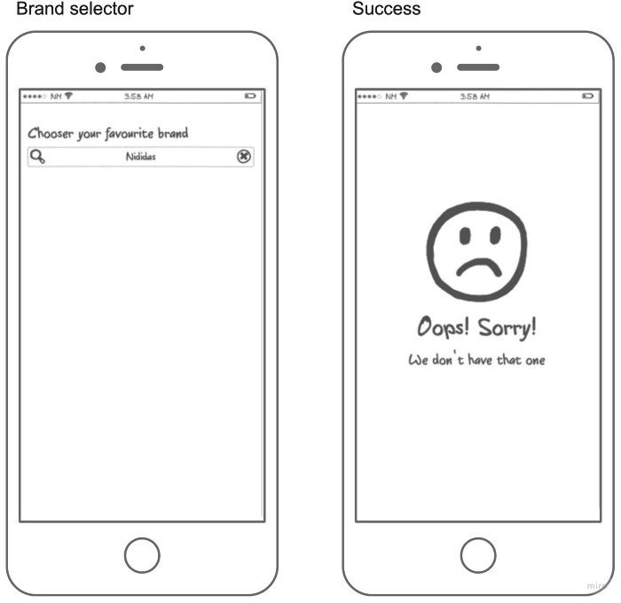
As a first solution, we might be tempted to decide not to show any result on our first screen if we don’t match any product to our user’s query to solve the first issue. Meanwhile, the second one is really problematic, because at this point the user has made two choices and we need to tell him there is no stock.

Now we are getting into the real problem, the empty state, this is a very poor way of managing an empty state, on the selector screen the user has no feedback, which is really bad, as the user can be confused, not knowing if he needs to wait for something, or he might be even thinking the app crashed. In the second screen, we tell our user which is the issue, but he is going to be facing that feeling of: "everything I did is lost". But more important, in both screens, there is no clear next action other than close the application.
Guiding through emptiness
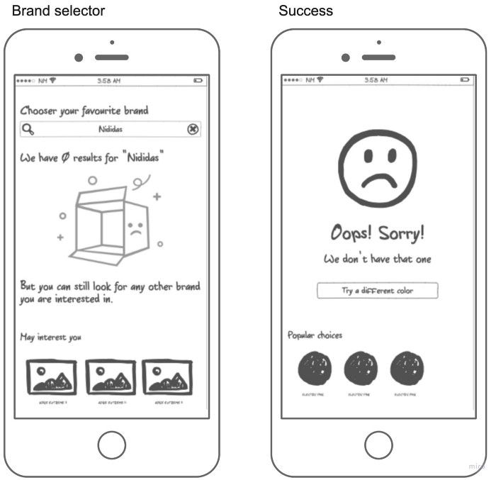
It's time to make this empty state gorgeous. As a first iteration, we need to add some clear feedback for the user, it's important in these cases that the user knows what's going on, and more important is that he needs to understand our application is not useless, and he can keep using it.

To start with, we can add visual feedback to our choice, making it clear to the user what had just happened, in addition to this we should also explain to the user how to continue. In this particular case as the search bar is still being displayed on the same screen we can simply tell them to use it.
But that's not the case in the success screen, as all our choices disappeared from our screen, in this case, we can be more aggressive and add a button to go back to the previous stage, this way the user won't feel all his progress is lost. He's still two clicks away from getting his shoes.
Both of these solutions have something in common, we are "undoing" the last step and requiring the user to re-do it, but sometimes we can guide forward from the emptiness itself.
Guiding to a brighter next step
Sometimes we can save time for our users, and also get closer to a conversion simply by showing them a different choice that will guide them to the next step. This way they don't need to re-do the previous step every time they choose an option that might guide them to an empty state, we are also giving them the security that this choice will result in the desired outcome for them.

In our app, the effectiveness of the first screen will depend on how good is our system to recommend similar shoes. If we can get a good recommendation we are potentially not losing a user. On the second screen, it's more about showing quick buys for the product they've already chosen, at the end of the day both additions are trying to allow the user to go one step forward without the friction of re-doing a step.
Conclusions
Empty states are important, you might be losing customers just because your empty state is a dead-end with no action/explanation about how to continue. We should not forget that frustration is a common dropoff reason, and what's more depressing than not knowing how to continue?