Traffic light usability report —and how to communicate your test results


Sometimes when you are running some usability test is really hard to get quantitative results, and it's even harder to communicate those results in an effective way to other stakeholders. It's common that when you are running your first usability tests you just get qualitative data, and most of it is just from your analysis of participant behaviours, which is also valuable. But it's not always the most efficient way to communicate results to your coworkers.
That's why it's always useful to run your usability tests with a traffic light report close to you, but first of all, we need to know what a traffic light report is and how it'll help us to transfer information to the rest of the company.
Traffic light report
A traffic light report is a visual way to figure out where the users are struggling in our application. The most important information it gives us is how hard is a specific task for our users, and how hard to use is our application for each specific user.
The system is pretty simple, you write down some tasks you are expecting your user to perform, for example: pick a pair of shoes. Then you give those tasks to your users and check how easy it was for them to perform them.
If it was clear to them what to do you assign a Green value to that task. If the participant found some difficulties but was able to perform the task with minimal/no guidance then it's a Yellow. On the other hand, if he required assistance or it was really difficult for them, then it's a Red.
You can also add for example other metrics like time to perform the task. This metric might be helpful to set the value. For example, if you have run this task several times with different groups you might have a bunch of previous results, so you can assume that a specific task requires about 5 seconds, with this information if some user takes more than 10 seconds to perform it, even if he required no assistance, you might consider him into the Yellow group.
One example to understand it better
Let's say we have an online shopping application. This application has a complex signup funnel as it's trying to gather as much information as possible from the user to give specific recommendations once you signed up, and it also has a shopping tool inside where you pick a product and just buy it.
We'll create for our usability test three tasks:
- Sign up
- Pick an item
- Checkout
Here is where you need to be smart if you just pick small tasks such as selecting a colour it might be too descriptive to the participant and give him an extra hint, also we don't want to overwhelm them by giving them a big amount of tasks to do.
In this case, for example, we'll divide the first task into four sub-tasks. We'll also divide the other two tasks into three and two sub-tasks. It's important to know how much granularity we want to achieve from this test.
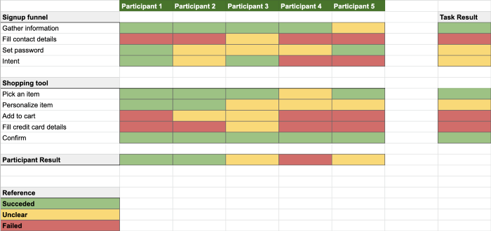
In the following image, we can see the results of the usability test from five different participants, we have it structured in an easy-to-read way, and we also get the overall result for each participant and for each task. It's important to know that some tasks that are really difficult for some participants can result really easy for another participant. Here is when your persona analysis needs to shine like a sun.

From this test, we can easily get the critical tasks to improve are: Fill in contact details, Add to cart, and Fill in credit card details. As a common pattern, we can also see that we are struggling when the user is required to fill something, maybe it's time to rethink our forms.
These results are easily transferable to any stakeholder without any issue, as we can see the report is pretty simple and self-explanatory, you just look for the red sections to see where are the users struggling. It might be even better if we add the time to perform each task.
Conclusion
Sometimes we struggle to transfer results from usability tests. This is usually because we don't get quantitative results in a proper way and we rely on qualitative results from our observations.
But there are a lot of ways to get easy-to-read reports that can also add some quantitative information to our stakeholders.